Sunday, June 24, 2007

Poster for World Peace concert in Dubai - 1

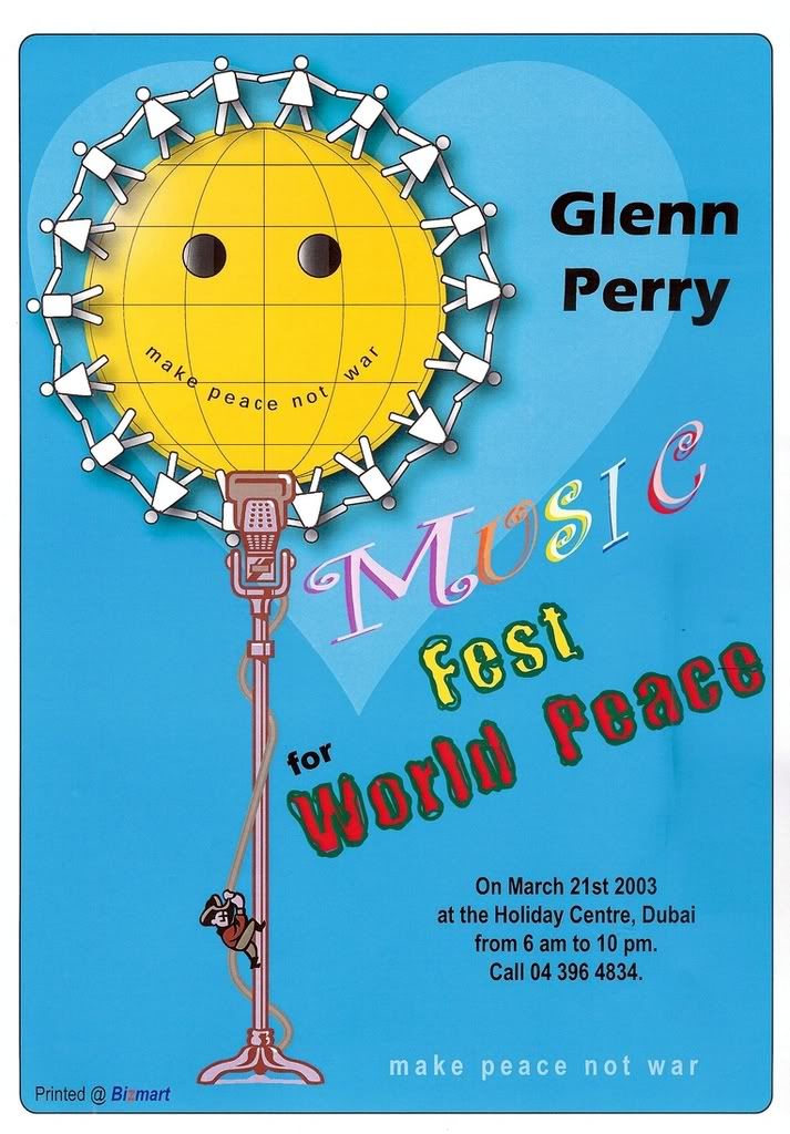
BACKGROUND: In 2003, between January to October, I worked with Glenn Perry in creating posters, ads and press releases for his concerts in Dubai. Though I'm only an amateur designer, I suited Glenn's purpose well. Reproduced here is the first of the posters that I had designed.

CLIENT:
Dubai Music School - Glenn Perry

PRODUCT / SERVICE: Concert - Music for World Peace

BRIEF: To make a flyer/poster for Music for World Peace concert that conveys the theme 'Music for World Peace' and which will be also adapted for a 10x2 print ad (Gulf News)

MEDIA:
1) A4 sized colour Poster / flyer to be laser printed and distributed 2) Print Ad - Gulf News - Tabloid

YEAR:
2003

ART:
Umesh Ponnusamy

COPY & IDEA: Umesh Ponnusamy

INSPIRATION:
The time was around when the 2nd Gulf War was about to start. War drums were sounding. Glenn Perry had to do a Peace concert. In my discussions with Glenn, he mentioned 'World Peace' a lot. When I was trying to visualize a solution....I remembered the Smiley icon that was famous in the 60's antiwar protests. I found the vector "World" icon.I added eyes to it and made Glenn's slogan "make peace not war" as the smile!

Then I also remembered another Unity symbol of people holding hands. I created the man and woman icons in AI9 and had them circling the globe. So this illustration took care of the "World Peace" part of the communication. Now what about music?

I browsed through all the available vector clips in the AI9 library. I found the cool looking mic and stand with a cowboy climbing up the wire...looked like George Bush! And there...that completed the imagery.

I also worked a bit trying to select the right fonts and colours that potrayed the mood of the communication. I found a heart vector and added it at a lower opacity in the background blue to symbolise spiritual love. The same poster was adapted for the press ad. Glenn loved it. A few text corrections were made and it went into print.

Here is a clickable thumbnail in case you are not able to view the image above:


Tuesday, May 1, 2007

[Print Campaign] Synergy Financial - My first print campaign


CLIENT: Synergy Financial, Chennai, India
PRODUCT / SERVICE: Financial products and services
BRIEF: To communicate that Synergy Financial is a Trustworthy, Reliable and Secure financial company because of:
a) 40,000 depositors
b) Rs. 60 crore depositor base
c) Investments in Hire Purchase


MEDIA: 50 x 2 Paper Ads
YEAR: 1997
AGENCY: Goldwire Communications, Chennai
YEAR: 1997
ART: Shaji
COPY & IDEA: Umesh Ponnusamy

INSPIRATION: When I was given the brief with the 3 primary benefits (listed above) and the client requirements of stressing upon the values of Trust, Confidence and Security. I started ideating with these in mind and decided to link each primary benefit with a value in separate ads. That's when the idea for using verbal imagery of POWER struck me. The headline and subhead were linked with this idea. The third ad is missing - I couldnt get a copy.

After I revised the headline and copy a couple of times guided a bit by Shaji who was then the Creative Director at Goldwire and Paul - Branch Manager and Account Head for Synergy. The layouts were approved on the first go with minor changes. This was my first ad campaign that actually went into print in The Hindu daily in Chennai. Though the size was small, it was noticed. I personally would have preferred a different kind of creative execution that went with the POWER theme...but I guess Shaji's approach got the ads noticed.

By Neil French's standards, this would be a weak ad, as it has all the elements - headline, subhead, bodycopy, visual, logo, baseline (btw the baseline was something that I led Paul to come out with).


AD 1 - POWER OF TRUST

Headline : The Power of Trust
Subhead : 40,000 depositors have plugged into it.

Bodycopy :

Synergy Financial

· Steady growth for the past 5 years

· CRISIL FA+ rating

· The only Indian finance company to have an Ombudsman.

· Rs. 60 crore depositor base.

· Safe investments in vehicle finance with a good recovery rate.

Baseline : Synergy Financial - Power to the Depositor.


AD 2 - POWER OF CONFIDENCE

Headline : The Power of Confidence
Subhead : Rs. 60 crore depositor base..

Bodycopy :

Synergy Financial

· Steady growth for the past 5 years

· CRISIL FA+ rating

· The only Indian finance company to have an Ombudsman.

· 40,000 depositors.

· Safe investments in vehicle finance with a good recovery rate.

Baseline : Synergy Financial - Power to the Depositor.


Tuesday, April 24, 2007

Illustration - The Ideator - 2002

Created this in Adobe Illustrator 9. The idea for this sprang up in 1997 in the meeting room of my ad agency in Chennai where a boring meeting had me creating paper toys. I crafted it into the present form finally in 2002.


Creative Commons License


This
work is licensed under a
Creative Commons Attribution-Noncommercial-No Derivative Works 2.5 India License.

Sunday, April 22, 2007

Design - Greeting Card for Pongal - 2004

Here's a quick simple greeting card that I had skectched for Pongal (a famous spring festival unique to the south Indian state of Tamil Nadu) in Adobe Illustrator CS.

Photos - Advertising Photography course - Final Year Project

In 1995, the Visual Communication department at Loyola College, Chennai offered Copywriting & Advertising Photography as a final year major. Being a part of this batch, we were required to hire a studio with professional equipment to shoot food products, automobiles, garments etc. for the final project.

Me and my friend Vijay adopted a more creative route and used table lamps, a good Yashica manual SLR, tripod, macro lens, 400 speed film and shot at home with available props.

The photos came out much better than what other had shot at expensive studios! Our instructor, ARC Shanmugam had given me a 94 on 100! But some students raised a furore over what they felt as unfair scoring and our HOD - Fr. Rajanayagam re-evaluated and cut down my score to 84 I think!


Used a glass top tepoy at home. Switched off all the lights. Used an emergency light with fluorescent tubes to illuminate from underneath. It featured a male body spray surrounded by perfume sprays for females positioned to look like they were being attracted to the male spray.


The above 3 shots were for a food product. Just shot 3 quickies using a macro lens and some creative arrangements with available props. Thinking back, I should've made the violin doll a brand icon and should've featured him in all the photos.


A shot of another food product...a kind of lifestyle feel for the product.


The effect in the above photos of the bike was more of an accident. Featuring my classmate Ramesh and Nirmal's bike, the above photos were shot at around 12 am midnight outside the Loyola College church which was pitch dark. The camera aperture and shutter was kept open and we walked around the subject illuminating it with bursts from the flash. This technique was called something....I forget now...there was specific name...but the technical name seems to be "long exposure multiple flash" night time photography.

Collage on Corporate Creativity - 1995

An inspirational booklet on the topic of corporate creativity (a precursor to the powerpoint presentations that are circulated through emails) that I created from various newspaper and magazines advertisement clippings:


Strawberry Stripes Sale - My 2nd published ad

AD SCAN:


CLIENT: Strawberry Stripes, Chennai, India

PRODUCT / SERVICE: Kids Nightwear

BRIEF: To communicate that the popular Strawberry Stripes Kids Nightwear Sale is back again !

MEDIA: Print- Newspaper (The Hindu) 10 x 3

YEAR: 1994-1995

AGENCY: Purple Patch - Minoo Jha, Chennai, India

BACKGROUND:

Comments : My first advertisement to be released of which I could get a copy. The first ad of mine to be ever released was HILL COUNTRY RESORTS - it was a full page ad that was released in Dubai...I couldn't get a copy...working in a copy services firm had its limitations...sometimes, you couldn't get art pulls and the like for your portfolio.

Inspiration : Once given the brief which said that I had to communicate that the Strawberry Children's Nightwear sale is on and that the last year's sale was a success...the starting of Pink Floyd's "Blue Skies" from the Wall struck me... a child's voice is heard to say -"Look Mommy ! There's a plane up there in the sky." This seemed appropriate to me as mostly mothers would be interested in shopping for their kids. So my line was dramatic one and drew the attention of the right audience too. I just had to substitute my product in that line and add the word "Again" to give the product a familiarity. Minoo approved it at the first go. I even had a cute visual for the ad which was attached with the copy sheet and sent to the agency but was not taken.


Headline :

Look Mummy ! It's Strawberry Stripes Children's Nightwear Sale Again !
(7th to 11th April - including Sunday).

Bodycopy :

Yes, folks, we are back with your favourite sale. Of our unique, comfy nightwear for your little angels aged 3-12.

Smart night suits for boys, dreamy night dresses and pyjama night dresses for girls. All tailored with the hallmarks of Strawberry Stripes - unfussy, cozy, comfy and reasonabley priced. Also don't miss out on our special prices.

Better hurry, stocks are limited. And you have just 5 days to go.

Baseline :

Smart reasonably-priced clothes for kids 0-12.

Hill Country Resorts - My 1st published print ad

CLIENT: Hill Country Resorts

PRODUCT / SERVICE: Time Share Resorts at Kodaikanal

BRIEF:
To communicate that Hill Country is the only resort company to open its Time Share resort on time.

MEDIA: Print advertisement, Full page

YEAR: 1994-1995

AGENCY: Purple Patch, Minoo Jha

BACKGROUND:

My very first published advertisement that I wrote copy for was a full page one published in Dubai. Hill Country Resorts, Kodaikanal wanted to communicate that they were the first time share resorts in Kodai to open on time as promised.

Guided by Minoo, my first copywriting guru, she helped me craft the headline. Aparna, a colleague worked with me a bit on the bodycopy..specially the 'As You Like it' bit.

The only copy (art pull) I had of the ad was submitted for my final copywriting project in college.

Posting the copy below:

Headline :

If opening a holiday resort on time was like running the Olympics 100 metre dash final, we'd get the gold.

Bodycopy :

The excitement and tension in running the Olympic 100 metre dash final and the exhilaration when you win the gold...that's what we feel at Hill Country Resorts, Kodaikanal. Because we are the first holiday resorts in India to open on time. That's good news to our time-share investors. They can now avail of our time-share at the earliest and experience Hill Country- Kodai's special privileges :

Two's Company, Three a Crowd
We at Hill Country have ensured that you can enjoy your holiday without you and your neighbour stepping on each other's toes. By providing lots of space between the cottages and all around them.

A Beautiful View is Worth a Thousand Words
A thousand words is what it would take to describe the view from your Hill Country cottage window. And it would surely take less to describe the shabby view which you get at our neighbouring competitor's.

Home "Sweeter" Home
You'll find Hill Country cottages cozily designed and comfortably furnished. And the architecture...transports you into a fairy tale world when compared to the box like concrete structures at other resorts.

No more "Q" please
At Hill Country-Kodai, you'll also find our facilities more user-friendly. You won't have to experience the 'law of the jungle' and the 'survival of the fittest' as in some of the other resorts.

As you like it
And finally, at Hill Country-Kodsai, you'll enjoy the privilege of exchanging your week at your convenience and without any fuss.

So...
What are you waiting for ? Dash to Hill Country...